Showing posts with label analysis. Show all posts

Wednesday, January 11, 2017

Design Inconsistency

Consistency makes life easy.  Consistency makes sense.  Consistency in design reduces learning curve and eliminates confusion.  We subconsciously expect consistency and harmony around us.

Consistency has always been important in design of everyday things.  It is especially important when it comes to human machine interfaces.  Consistency makes everything seem normal and we feel at ease as we can operate in auto-pilot.  Imagine if the location of the accelerator and brake pedals were switched based on the brand of the car.  Every time you rent a car, you need to retrain your brain to this new interface.  This inconsistency is not only frustrating but can also be dangerous.  I remember a friend getting into a serious accident while riding another friend's bike in which the brake and gear levers were reversed (non-standard).  It was part of the design of the bike but in critical situations, the brain goes into auto mode and just does what it has always been doing.  He ended up frantically pressing the gear lever instead of hitting the brakes.

Another example is the riser of a staircase.  The designer can pick any height for the riser, BUT, it has to be consistent across the whole staircase.  Once a user starts climbing the stairs, the human mind programs itself to the height of the riser and we go into autopilot.  The user no longer has to look at the steps in order to continue.  The moment a riser is different (either shorter or higher), the user is guaranteed to trip.  Inconsistency is dangerous here.

We take notice when things are inconsistent.  Because inconsistency confuses us and throws us off.  It also frustrates us.  Here is an example I noticed recently at a Sheraton hotel in Vancouver.


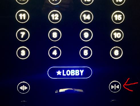
During all my travel, I have always noticed that the elevator design is very consistent (but for some special cases like this) so as to provide the user with a familiar feel.  The 'door close' button is always on the right hand side and the 'door open' button is on the left hand side (Whether the door close button is a placebo button or if it actually works is a topic for another blog.  Let's stick to the design topic for now).  Once you hit the floor button, you subconsciously reach for the button on the right side to close the door.  I did exactly that and the door kept reopening.  I was distracted by my phone and did not notice why this was happening until, out of frustration, I 'looked' at the button to discover that it was reversed and I was hitting the 'door open' button.  Duh.

This case was not a 'designed inconsistency'.  It was an 'inconsistent inconsistency' because the other three elevators were all consistent and standard.

Inconsistency can be refreshing in some cases and can be an advantage.  An example is a web site (or a mobile app) design that is not consistent and does not follow the norms of design will always stand apart and draw the user's attention.  And, user attention is what everyone is craving for.  Again, the inconsistency should be subtle and not all over the place.  If it is extensive, it tends to drive the user away.

It is OK to be inconsistent when you want to draw attention, when you want to surprise (pleasantly) the user or when it is dictated by the design.  Designers have to make a conscious choice when to apply inconsistency to their design and what it would mean.  A thorough analysis should be undertaken before introducing inconsistency.  

Thursday, March 5, 2015

Planned Obsolescence

I recently watched a documentary on BBC about planned obsolescence.  It is an interesting view on the current marketplace and how companies have been designing for obsolescence. This phenomenon has been going on for a long time. 

I remember as a kid when all the ballpoint pens had refills, not just the high priced ones.  You bought a pen or two and kept replacing the ink cartridge refills.  Or, you used a fountain pen and bought ink bottles to refill the pen.  I must have gone through most of my primary education with just a few of these pens.

And then I came to the US where everything is disposable.  Bic pens were the first disposable ballpoint pens I used.  I was shocked to see people chucking pens in the trash as soon as the ink ran out. 

Fast forward to 2015.  People are chucking MP3 players and phones as trash as soon as the battery runs out.  Or, in some cases, as soon as the newer version is released. 

Thanks to the advances in 3D printing, we are coming up with technology to literally 'print' everything as a single unit.  No need of assembly, dis-assembly, servicing, replacement of parts, and such things.  You buy one unit and throw it away at the end of its life.  The end of life could be defined by either its functional usefulness or its capacity (battery life, ink, etc.).  This is ultimate consumerism at work.

What this is doing is making consumers spend more and buy more.  This will help corporations sell more and make more money, but we have to look at its global impact.
  • What this does to our environment?  
  • How is it recycled?
  • How do we separate the components for recycling?  
  • How much does it cost to recycle?
There is always a fine line between usability, design and being responsible to your consumers, to the environment, to the economy and to the world as a whole.

There are cases where this technology makes perfect sense.  Say, parts for a satellite which are never serviced once launched.  These parts need to work in harsh environments and need all the protection they can get.  These parts could be built as a single unit so that they are well sealed and can function optimally.

Nanostructures come to my mind as a great fit for this technology but unfortunately, the current 3D printing technology is still measured in mm and not in nm.  These structures are too small to assemble.  It makes more sense to just build them as one cohesive unit. 

3D printing is seen as a boon for making spare parts when none are easily available.  Companies are taking 3D printing to places where no man has gone before: printing food, printing prosthetics, printing tissue, printing organs and other areas that we have not imagined yet. 

We truly live in an exciting world today! 

Saturday, January 31, 2015

Brand Love

I was at a Marriott in Minnesota recently.  It was cold and snowing that week.  One morning I get up and look out of my window to see the road and the lawn completely blanketed by snow.  I got ready and came down to go to the client office.  I had equipped myself with a muffler around my neck, ear muffs, winter gloves and a coat.  I was ready to brush the snow off my car and scrape the ice off the windshield. 

I walk out and am greeted by a car that had no snow or ice on it.  I glance around to see that someone had cleared the snow and ice off all the cars in the parking lot.  I was, to say the least, pleased with the pleasant surprise Marriott offered.  They made my life easier and they made me look cool.  While all my colleagues (staying at another hotel chain) were sweating in the Minnesota cold scraping ice off their windshield, I simply got in my car and drove off.  It not only saved my time but also saved me from the trouble of clearing show and ice in sub-zero climate.  You can bet I am going back to that Marriott.

This got me thinking about customer loyalty and brand loyalty. 

What is Customer Loyalty?

Customer loyalty is where a customer is loyal to a particular company/service/product.  Customer loyalty can be garnered by offering rewards, discounts and other perks. 


A simple act like clearing snow off cars, which is not part of their SLA or contract goes a long way in making the customer happy and finally loyal.  What Marriott did was make me cool and kick ass.  This reminded me of one of Kathy Sierra's posts on this subject (Image courtesy: Kathy Sierra).  

Brand loyalty, however has to be earned in a whole different way.  Brand loyalty is earned by offering exceptional products and services.  

Companies like Apple command brand loyalty mainly by producing excellent products that consumers want.  The products are of such high quality that they command a cult-like following of brand loyalists.  Apple has also creates an ecosystem (iTunes) that ties the customer into their products for a seamless experience (and forced brand loyalty).

Other companies indirectly force brand loyalty.  Take for example Canon or Nikon in the imaging market.  Once a consumer invests significant amount of money on the foundation product (say, the camera body) and a few accessories (say, lenses, flash, etc.), it is hard to switch to another brand due to the fact that they are different standards (say, lens coupling).  Switching would mean an entirely new investment to get back to where you were.  Not that these companies produce inferior products.  Both produce products on par with each other which makes it even more difficult to keep customers from wavering.  Hence, proprietary standards like lens coupling ensure brand loyalty. 


Customer loyalty is directly related to cost, discounts and rewards.  Once the rewards and discounts vanish, the customer will easily wander.  But, brand loyalty is not related to any of the factors mentioned above.  Irrespective of the cost or rewards, customers will always be loyal to the brand.  This kind of loyalty can only be commanded by producing exceptional products.

Everyone takes great service for granted.  Great service is not going to garner loyalty.  But the opposite is absolutely true.  Bad service will absolutely drive away customers.  Businesses should concentrate more on dispute resolution than on exceptional customer service.  It is human to make mistakes.  But, what sets apart great businesses is how they resolve disputes.

Businesses should concentrate on both customer loyalty as well as brand loyalty.  They both require different strategies and resources, but go a long way in customer retention.

Remember, the cost of customer acquisition is always higher than the cost of retention. 

Wednesday, January 28, 2015

16 Things from A16Z

Andreessen Horowitz published 16 areas they are focusing on for 2015.  This list is a good bellwether of what areas to research, work on, invest in, etc. 

Monday, March 4, 2013

iWear


There has been a lot of speculation on the iWatch that Apple is working on.  Analysts are comparing it to the other watches available and are peering deep into the watch industry for insights on the market, revenues and margins.  What everyone should realize is that the iWatch (or whatever Apple chooses to call it.  In fact, I would call it iWear) is just another wearable computing device.  I don’t consider it to be a watch.  I hope it is much more than a watch.

Let me talk a little bit about watches.

A watch, per Wikipedia, is a device that tells time.  It is a timepiece.  It is generally worn around the wrist or attached to a chain and carried in the pocket.  Traditionally, watches have been either manual or automatic (driven by kinetic movement).  These watches have slowly progressed from just telling the time to being a calendar and then being a stopwatch.  These additional behaviors are called 'complications'.  There are a few automatic watches that perform the function of an alarm clock too!   There are smart watches (not in the computer smart terms), which understand the variation of days in a month (yearly calendar watches) and there are those which can even compensate for the leap year (perpetual calendar watches).  There are watches for the blind.The video below shows a Patek Philippe watch with a chime!


These are mechanical marvels driven by just a flywheel that charges one or more springs either based on manual winding or the kinetic movement of the wearer’s hand (or the winding machine).

Then came the era of electronic quartz watches.  These were powered by small batteries and were completely electronic.  Quartz crystals, by their nature are very accurate leading to extremely accurate watches.  Additionally, the electronics afforded designers to add additional functionality into the watches.  These watches had lights to see at night, multiple time zones, stop clock, alarm, and other features.  And, there are the techy watches which need a degree in computer science to tell the time.  The quartz electronic watches were also fashionable since they were tiny and could be fashioned into any shape and size.

There have been several watchmakers who are trying to reinvent the timepiece.  Urwerk is a classic example making high end watches that beat the conventional wisdom.

The watch market is a thriving market.  There are people who buy one watch to tell time.  There is a segment of the market where watches are akin to jewelry.  They buy several; one for the office, one for sports, one for the evening party, one for the black tie event, etc.  There is another segment that just buys watches just to collect them.  I belong to this segment.  I guess we haven’t heard the Confucius saying ‘Man with one watch always knows what time it is.  Man with two, never sure.’  The watch market is huge.

I have always wondered about one thing.  Whenever I walk into a meeting, I look around to notice what watch everyone is wearing.  I am sure anyone who is interested in watches would do the same.  I have never, let me say it again, never been in a room (full of people) where I saw two people wearing the same brand/model of watch.  There have been some rare occasions where two people were wearing the same brand, but never the same model.  That itself shows you the market for the variety of watches.  The global watch market is about $60 billion a year with a margin of around 60%.  Everyone is looking into the watch market and wondering how Apple will disrupt it. 

If Apple is targeting the watch market, it is looking in the wrong direction.  Apple should be looking at something that is much more than the watch market.  In fact, when Apple releases their iWear, people should buy it, and still be buying/wearing watches. 

The point I am trying to make is that Apple should not be getting into the watch business.  The watch industry will thrive by itself, and there are many disruptors around.  All phones have a timepiece functionality built into them.  The phone industry has had incredible penetration in the past decade.  Did it affect the watch industry?  Nope.  People still wear watches.  Quartz watches came and kicked the traditional mechanical watch’s butt.  But, I still buy mechanical (manual winding as well as automatic) watches!  My computer has a very accurate clock.  My cell phone has an incredible clock which automatically adjusts to the timezone I am in.  Still, I wear my automatic wristwatch which loses about a few secs a week (which, by the way, is pretty bad).  Why do I still wear it?  It is a part of my attire.  One reason may be that I love the mechanical marvels (automatic watches) and want one ticking away on my wrist.  I have not seen people ditch watches in droves since they are carrying their cellphones with them. 

Apple should be getting into the wearable computer industry.  We do ‘wear’ our cellphones, but there is a huge difference between carrying a device and wearing one close to your body, close to millions if not billions of interface points (skin cells, veins, etc.) to a human body.  This affords incredible opportunities in various areas of which telling time is the least important one. 

With a computer strapped onto my wrist, the device can be:
  • a health monitor (heart rate, temperature, etc.)
  • a pedometer
  • an alarm
  • a safety monitor
  • a tracker
  • a phone
  • a camera
  • a music player
  • a video player
  • a device to inject medicine based on a schedule
  • a GPS
  • an internet browser
  • a calendar
  • a timepiece
You get the drift.  It can be anything.  As long as you are wearing a computer on your body, there is no limit to what it can do.  That is where Apple should be heading.  Apple should build an ecosystem around this wearable computing device in the same way it built an ecosystem around iPod with its iTunes store.  This will afford incredible opportunities for smart entrepreneurs to innovate and bring great applications to life.

I am excited for Apple and am ready to pounce on this opportunity.

Thursday, October 25, 2012

Gamification in life

Amazing talk by Carnegie Mellon University professor of Entertainment and Technology, Jesse Schell.


Thursday, January 12, 2012

Google Android Market or Amazon Appstore

I recently worked on an app (520or90.com) as part of Seattle StartupWeekend. We developed a web site, an iOS app as well as an Android app. When it came time to publish our Android app, we had to make a choice of where to publish it? Google Android market or Amazon Appstore or both? We finally ended up publishing on Google Market. We are planning on publishing the app on Amazon Appstore at a later time. Here is the reasoning behind the decision:

Timing:
We had to get our app out on time because our release date was inflexible. SR520 tolling had started, and the commuters were going to hit it as the new year (2012) rolled in. We wanted to be there to help the commuters make an informed choice when they had to cross lake Washington.
Google market promised to publish the app instantly as long as we adhered to their ToS. And, our app did.
I had heard that Amazon market took about a week (or more) to review and approve the app. [We were having the same issue with our iPhone app. It was the first one out of the dev gate, but had stalled in the iTunes approval process. Thanks to the holiday season and all.]
Timing-wise, it made a lot of sense to go with Google market.

Access:
We wanted the users to have easy access to the app, and wanted a seamless install process.
All the Android devices (phones) I have seen come with the Google Market app installed on them. As for the Amazon Appstore app, one has to install it manually. I am sure the Kindle Fire will come installed with it, but we were targeting all the Droid phone owners.

Usability:
Based on all the apps I have installed from the Amazon Appstore, they seem to suffer from the 'ET phone home' syndrome. I for one, do not log into the store all the time. So, the apps stop working when they cannot call home. I understand that some of the paid apps are licensed on the server, and they connect to the mother ship to verify the license. But, what about free apps? Why do they have to connect? Download new ads? We didn't want our users to go through this.

Cost:
Android dev license fee is one time $25. Amazon AppStore subscription is $99/yr. But, Amazon waives the first year fee, to lure new developers. So, cost was not a driver in this decision.

Reach:
Google Market can publish apps around the world.
Amazon Appstore only allows publishing within the US.
This really didn't matter for us since we were hyper-local (Puget sound only). But, our Droid carrying friends in India and other countries could not have enjoyed (tested) the app if we were on Amazon.

I do know that Amazon Appstore has other advantages: Ability to use Amazon account to pay (1-click). Ability to purchase once and use on multiple devices using the same credentials. Amazon does market the apps by offering them free for a day. You need to be lucky to be picked, though. This has its own pros and cons.

Of course, with the Kindle Fire, there is only one place to buy your apps - Amazon Appstore. So, if you want your app on the Fire, then you better publish on Appstore.

Sunday, November 13, 2011

Web 2.0 Internet trends

Every year, Mary Meeker looks into her crystal ball and gives a presentation on the internet trends. These presentations are filled with a lot of data and analysis. In case you haven't seen the 2011 presentation, here it is:


Here is the PPT if you want to go over the slides at your own pace.

KPCB Internet Trends (2011)

Wednesday, October 19, 2011

Lytro

What is Lytro? How is it differentiated from the competition? What is its competition? What is the current market? What is its message to the market?

The photography market can be roughly divided into professionals, prosumers and consumers.
Professionals care about the kinds of pictures they take and are looking for control, accuracy, dependence and ruggedness in a camera.

Consumers are not very particular about the picture quality and accuracy. Consumers care about how quickly they can capture the picture and upload it onto their favorite social network. Consumers also want the ability to capture video using the same camera.

Prosumers care a bit about the control and picture quality but are not very concerned about dependence and ruggedness.

Professionals and prosumers tend to gravitate towards SLRs and consumers move towards P&S cameras. Of late, consumers are moving towards cell phone cameras in droves. Especially after the introduction of smart phones with high pixel count and featureful cameras. Consumers are more interested in snapping a picture or shooting a video and uploading it onto the Internet instantaneously.

So, where does Lytro fit in this picture? Lytro is currently marketed as a consumer camera. The main differentiation of Lytro is that it lets you capture an image without first worrying about focusing it. This is something unique and no other camera can accomplish. Of course, there are several single focus cameras in the market. But, what Lytro promises is the ability to focus after taking the shot. Due to the nature of the lens structure, it is hard to pack it into a cell phone. At least, not right now. The current form factor is completely different than anything in the market. It is neither pocket nor palm friendly. Based on the current design, it is a hard sell to consumers.

Prosumers would be interested in the camera because of its novelty. Prosumers and technology geeks will buy it for the sake of technology so they can play with it and hack it.

Professionals could immensely benefit from the creative opportunities offered. But, professionals need control, accuracy, ruggedness and dependence. Lytro does not offer control over aperture and shutter speed. It only offers the ability to change focus, after the fact. It has a fixed aperture (f2.0?) and no way to control the shutter speed.

Until the Lytro technology can be put into a tablet or a smart phone, it is hard to sell it to the average consumer.

So, what features can we add to the Lytro to make it attractive to prosumers as well as professionals? Control is the biggest factor for this group.

The ability to control the image composition via variable focal lengths, aperture and shutter speed. The ability to convert the image into a standard 2D format after manipulation. This gives the user additional parameters (focus) to tweak after the shot is taken. This is tremendous value for professionals, as long as they can convert the final product into another standard 2D format and print high quality images.

Right now, the camera is taking away a lot of the controls from the user and giving one back. The value add from the new feature is not sufficient to replace the lost ones. That is where it is hard to differentiate and sell the camera to users.

As I mentioned earlier, law enforcement, security monitoring, etc. are areas where this technology can be very effectively used as it is.

(Update) Based on this article, Steve Jobs was interested in this technology. Maybe, Apple is waiting for the technology to become mature enough so they can acquire it and have Jony do some magic with it.

Apart from these exits, Lytro could end up being another Segway.
(Photo credit: Lytro.com)

Sunday, September 11, 2011

Lessons from Angry Birds

I am flying back home from San Jose and have a ton of catchup work to finish on the plane ride. I board the plane and get buckled in. While waiting for the doors to close, I take out my cellphone and start flinging birds. I am excited that I am kicking a$$ and jumping into new levels. The door closes, plane takes off, and finally lands in Seattle. I have completed multitudes of levels by this time. Yay!!

And, then I remember all the work that I had planned on accomplishing on the ride...

Not to mention that it ended up being a long night.

Ever wonder why Angry Birds is so addictive? Here is an interesting infographic trying to explain it.

There are a lot of takeaways from this analysis. It helps us list the key qualities of a winning and addictive app:
1. Simple with no learning curve
2. Rewarding. Users get primitive pleasure blowing things up
3. Realistic. Great physics
4. Funny. Creatures' sound, laughter and backflips
5. Anticipation of the reward of progressing to the next level

These form the fundamentals of a great game design.

Thursday, August 25, 2011

Lessons from the demise of TouchPad

It was Saturday morning and I am at Best Buy standing in line outside the door waiting for the store to open. There were around 20 people with me, all excited to get their hands on the $99 TouchPads. The door opens and we all walk in and start looking for TouchPads, only to be told by the sales staff that they have none in stock. Everybody is flabbergasted that the store has lots on stock the previous evening and none this morning. We all return empty handed.

I started following a Twitter feed for tips on where to score one. And, I do get a tip that it is in stock at barnesandnoble.com. I immediately rush over and place an order for my TouchPad. Everything goes smooth and my order in place, I relax for the rest of the weekend.

Monday arrives and I get an email from BN and I immediately open it to see when my TouchPad is arriving. But, to my dismay, the email says:
Due to unexpected customer demand for this item, our inventory was depleted prior to your order being processed so we are unable to fulfill this item as requested. Consequently, we have canceled your order and you will not be billed for this amount.

Dang.

Later on, I hear that another of my friend's order met with the same fate, albeit with another retailer.

What this tells me is that Best Buy had a lapse of communication, corporate not relaying the information to their stores in a timely manner. I did hear that the same store sold the TouchPads later during the day.


And, the Order Management (OM) system is not integrated with the Supply Chain and Inventory Management system at B&N. The OM system doesn't have a clue of the real-time inventory. They didn't have a clue what their Available To Promise (ATP) was. If BN had an integrated multi-channel OM system that was in sync with their Inventory Management system, this would not have happened.

What the TouchPad fire sale showed us was that most of the retailers are yet to mature in managing their multi-channel OM, Inventory and ERP functionality. This is a tremendous opportunity for them to squeeze more profits out of their supply chain by maximizing their supply utilization and inventory productivity. Maybe, the brick and mortar retailers can still survive (for some more time) if they get their houses in order and streamlined to reduce costs.

Photo credit: HP.com

Saturday, December 29, 2007

On eBook design


I thought of penning a few thoughts on designing an eBook reader, the hardware kind. After reading about Amazon's Kindle, I was wondering how the next version could be made better.

Here are what I feel are the requirements for a good eBook reader.
Ability to:
- Read
- Search
- Bookmark
- Annotate (Highlight, comment, markup, etc)
- Shared read (read along with another person)
- Loan a book
- Buy books, publications, etc.
- Turn page
- Turn multiple pages
- Leaf (flip) through
- Choose a publication to read
- Search for publications to buy/download
- Print
- Modify type size
- Single hand hold and operate
- Configure to individual taste
- Customize (software as well as firmware)

Phew. That seems like a big list, but it is what would make me switch from a paper book to an eBook.

Here are some of the desirable characteristics of an eBook reader:
- Should have a color display. In the days of color everywhere (have you seen a B&W TV or a computer monitor anywhere?), and publications using color, it makes a lot of sense to have color screen.
- Be easy to read. Should not be hard on the eyes and not produce eye strain. Easy to read in bright sunlight as well as in the dark.
- Easy to operate. Intuitive, with minimal buttons or menus. Shouldn't need the user to read a 200 page manual before using it.
- High quality display.
- Backlighting, for reading in the dark.
- Light and portable (preferably the size of a paperback).
- Configurable so users can tailor it to individual needs. I like to see page numbers on the bottom right, and someone else might like to see it on the bottom left. A left handed person might prefer to reprogram the buttons on the eBook to be mirrored.

Here is how I would design a new Kindle:
I would design the Kindle with a touch sensitive screen and incorporate a keyboard akin to iPhone's. Since the keyboard is utilized in certain actions (search, annotate, buy, etc) not directly pertaining to reading a book, it needs to be hidden out of sight. The only controls that should be visible are those that are "necessary" for reading. The only hardware controls that are provided should be directly related to the main purpose of the reader, which is Reading.
The rendering above is my concept of a eBook reader.
The book will be both right handed as well as left handed. The rendering above shows the book being held in the left hand of a person. If one were to hold it in the right hand, just turning the book 180 degrees produces the paging buttons on the right, AND inverts everything on the screen so that it appears in the correct manner. Now you understand why I have placed identical power buttons (again configurable to be anything) both at the top and bottom.
The reader would have a touchscreen and soft menus on the screen. Display thumbnails of the pages (as shown in the rendering) and allow users to leaf through the pages by flicking their finger on the thumbnails. Tapping on a thumbnail will take you to that page.
Single click of the page turners will turn one page, and double clicking them would turn 5 or 10 pages (configurable).
The header and footers should be configurable and provide content orientation clues like page number, chapter, section heading, book name, etc.
Of course, it would have a color screen. And, long battery life and all the other good stuff I haven't talked about.
Since the hardware uses a touchscreen and configurable buttons, the book could be customized to produce different menus as well as reprogram the buttons to do different things. Opening up the hardware to third party vendors and programmers will help drive the customization of the book.

For all you know, someone may reprogram it to act like a GPS or a video game console!
As for the improvements on the service side of Amazon's Kindle offering, that is a topic for another blog.
PS: The unnecessary random line breaks is due to a bug in blogger. Whenever I include images this happens. I am still trying to figure out how to fix it.

Thursday, December 6, 2007

Is Kindle going to kindle your reading?

Ever since Amazon released their Kindle reader I have been wondering why Amazon went into the hardware business. Amazon's core is their service offering, be it their online merchant services or cloud computing/storage services, and this move into hardware is a pretty far adjacency to the core. Move into far adjacencies (in this case, hardware) is always fraught with risks, especially when you don't have Jonathan Ive on your design team.

First of all, Kindle is not a replacement to a computer or a PDA or a web connected phone. One should realize that neither is the opposite true. Kindle is conceived to be purely a physical book replacement.

There are two parts to what Amazon has released:
- EVDO service to dole out the eBooks
- Kindle, the reader

In the first case, Amazon is trying to provide a direct wireless service to download books directly to the reader. No need to download to a computer and then transfer it into the reader. This is an excellent move from a services POV.

In the second case, Amazon has failed to produce a reader that is sexy and attractive to a sophisticated book lover. It has produced a reader with a lot of room for improvement.

The book market is $24 Billion a year in the US alone. This includes all categories of books. The eBook market $54 Mil annual and growing. This is a good market to be in, and Amazon has made a good move.

eBooks initially failed in the market because they were too early in their intro. Akin to Newton for PDAs. Newton failed mainly because the market was not ready for its acceptance, and the interface sucked. Its form factor sucked, and Apple learned a great lesson from this failure. Newton's hand writing recognition was flawed, but the main reason for its failure was the market timing. The same is true for the eBooks.

Until now.

Amazon is trying to copy Apple's model of creating their own mp3 players and selling them for a premium. Unfortunately, this only works if your hardware has the oomph to command a good market. Like this blogger, I also feel that opening up Kindle to be a platform and letting other developers come up with hardware will give Amazon the best bet in succeeding in peddling their eBooks.

DRM and activation requirements can kill the eBook. Books bought on Amazon cannot be read on other readers, and vice versa. Why not make it similar to a physical book. A physical book can be loaned to a friend. Why not do the same with an eBook. As long as there is only one copy floating around, there shouldn't be any problem. As soon as the book is transferred to my friend's reader, I can no longer read it on mine. Come up with a handshake transaction mechanism to move the book around. Make it simple for people to do with eBooks whatever they are used to doing with a physical book. And, remember, the best marketing for a book is to be read. If no one reads your book, it doesn't get sold.

One thing that Amazon needs to consider is the cost of the eBooks. They need to choose a pricepoint that will spur the eBook sales. I don't have any data on how many they have sold after the introduction of Kindle. But, I have a feeling that $9.99 is not a sweet spot for eBooks.

They could also look into the advertising model when it comes to periodicals and blogs. The time commitment for a book is huge compared to a blog posting or an article in a periodical. So, the Ad model might work when it comes to blogs and periodicals. I would never (directly) pay to read a blog.

Another point to consider is the service's longevity as this author points out. What if I plunked $400 on a Kindle, and the service shuts down in a few years? This hits upon the price point of the reader itself. Introduce an inexpensive reader, and once the service takes a good foot hold, introduce better models with more features, AND charge boo-koo bucks for it. Prove yourself first, and then milk the market.

Some things that would make an eBook successful can be learnt from the successes of the iPod:
- Interface - simplistic interface with minimal buttons that just did its job: Dole out music.
- Design - Need great industrial design
- Brand marketing
- Integration and connectivity of the player, computer, software (This has been solved with the EVDO delivery)
- Windows support (No need of platform support)
- iTunes store (Amazon store)
- Form factor
- And last but not the least is Accessories - Sleeves, jackets, the most expensive ones are cars!

Something that the Kindle could benefit from is style. And, a water tight case.

Some of the benefits of eBooks/Kindle are:
- A great boon for independent freelance writers. Akin to music and blogs, everyone of us could write a book and publish it!
- No worry about the book spine and closing books.
- You can also upload your documents to the reader to read them.
- They are green. They do not waste paper or other natural resources.
- Convert any book to large print automatically.
- Take up space of one book, but can hold thousands.
- Random access and searchability.
- eInk technology is cool and makes a great reading device.

Will be really cool if they can add a "reader" to it and make it an audio book. That would have to wait for good text to speech technology, though.

Look at what the MP3 player did to your record/CD collection. Books are going the same route. Of course, this will take a generation to happen, since the older generation is tightly knit with the physical book concept. The older generation did not grow up with computers. The new generation is growing up with computers and MP3 players and what not. They are more prone to adopting the eBook than anybody else.

In this day and age of access anything anywhere, eBooks are here to stay.

Wednesday, November 28, 2007

Switching to Digital


Many of my friends (who are switching from film to digital) have asked me what to look for, in a digiSLR. So, I thought of writing about it to benefit a wider audience.

If you look at the camera from a very basic point of view, it is just an instrument to capture light. How we do it is secondary. The main goal is to channel the light and capture it with the highest fidelity. Creativity can be unleashed by controlling the light.

A film camera is nothing but an airtight box with a hole in the front. The simplest form is a pin-hole camera. In order to capture as much detail as possible, lenses were introduced to channel the light and focus it. Film was added into the light-tight box to capture the light forever (almost). An aperture and a shutter, in combination, would allow the right amount of light for the right amount of time to make an impression on the film.

Everything remains the same with a digital camera. The camera is still a light-tight box. The same aperture and shutter control the light, the same lenses channel and focus the light.

What is different though, is the absence of film. Instead of the film, we find a photo-sensitive microchip. The chip converts the light rays into ones and zeros and stores them electronically. The chip is dumb and just captures whatever photons that hit it. Unlike film, which captures data at the molecular level, the chip captures data in pixels. So, is it better to get a camera with the most number of pixels? In general, yes. But, not really. There are too many parameters to consider in determining the quality of an image, and number of pixels happens to be just one of them.

So, what happens to the cool variations I am used to getting with switching from Velvia to Kodachrome?

This is where electronics and software enters the picture. The sensor captures raw data. This data is massaged with the help of software to mimic the features of a film camera. The better the software, the better your camera. So, should you go for the camera with the latest and greatest whiz-bang software in it? Not necessarily. Every digiSLR is capable of capturing the raw image which I talked about. The format is appropriately called RAW. If you shoot pictures and store them in this format, you could use Photoshop or other photo editing software to work your magic.

If you store your pictures in JPEG format, the camera would have already performed its software magic (of course, under your orders) and saved a compressed image which is much smaller than the RAW image. But, unfortunately, you would have lost a lot of data during the process.

So, where does it leave us?

For a purist, all the same rules that applied to buying a film camera still applies. Spend the most of your budget on professional quality lenses, a sturdy tripod, and a powerful external flash. And, always shoot in RAW mode. Don't forget to buy lots of film, er, memory.

For the hobbyist, all the same rules apply. Spend the most of your budget on prosumer lenses, a sturdy tripod, and an external flash. Of course, get the best body that you can afford. With today's array of features, it sometimes is hard to choose. Most of the popular cameras come with almost all the features: multi-point focus, multiple metering modes (evaluative, center-weighed and spot being the most common) and a next to useless built-in flash.

One feature worth considering while deciding is image stabilization. This is the ability of the camera (and lens, in some cases) to reduce the 'shake' in an image and improve its sharpness. This feature dramatically increases the range of shots you can shoot without a tripod. Something very useful. There are two types of systems: lens based and camera based. In the lens based systems, each individual lens comes with a built-in gyroscope to move lens elements to compensate for the shake. Pretty cool. The other system is where the sensor itself moves. The greatest advantage of the latter system is that it works with any lens in your bag. The photo above would have been crystal clear if I had image stabilization on my camera. It was shot hand-held at 1/10 sec shutter speed.

So, in short, things have not changed a lot, and a lot of the same reasoning still holds true. Just go get yourself a digiSLR and enjoy the ability to instantaneously preview your successes as well as mistakes!

Thursday, August 2, 2007

Design for Assembly

Have you ever bought anything that required assembly? Have you noticed how easy or difficult it was to assemble it? Have you noticed why many people shy away from these "assembly required" things?

One of the main reasons is poor design for assembly.

When you design something that needs to be assembled by the end user, make sure that you keep the end user in mind. As a matter of fact, whenever you design anything (furniture, software, ...), it is always a good practice to keep the end user in mind.

Take the case of Sauder furniture which requires "some" assembly. The instruction manual is usually a book! The furniture, be it a simple bookcase or a chest of drawers, comes with a wide variety of screws, nuts and bolts, and a thick instruction manual. And, to top it all, once assembled, they cannot be taken off without damaging the furniture. At least Sauder uses pictures and words in their instructions. I have seen some companies just use words. God help the assembler.

Another thing that pisses me off is that they always include the exact number of fasterers required. What is their problem in adding a couple extra in each size? If one of the bolts has a bad thread, you have to call an 800 number to get it from them, or make a trip to the local Home Depot. Remember that you can't even return it back since you have already started assembly.

In contrast, look at the things manufactured by IKEA. Not only are they beautiful, they are designed with the end user in mind. Their instruction manuals are usually a page with pictures. I have rarely seen words on their instruction manuals. Talk about Internationalization. And, they standardise on the fasteners and try not to use too many varieties. Most of the times, the items can be easily taken apart (for re-transportation) too.

And, they have bins with extra fasteners in their warehouse so you can pick a few if you need them.

This is elegant and thoughtful 'design for assembly'.

And, they include the tools needed for the assembly (most of the time, an allen key) with each item they sell. Who wouldn't love that?

Apple is another case of great design. Look at this example where Apple has included a paper clip which is needed for maintenance work. Not only have they suggested you use a paper clip to get the job done, they have also included one with the product. How often can you find a paper clip at home when you need one? So, Apple is there to help you.

This is another great example of 'design for serviceability'.

Monday, June 11, 2007

Design for usability

Here I go again, bashing another product for poor design. This time it is my digital watch. I have two watches, and I have lost the instruction manual for both. On one of the watches, I managed to set the alarm to 12:00 AM and was unable to cancel it. I tried pressing all combinations of the 4 buttons, but couldn't reset it. I finally gave up and had to remove the battery to reset it. The other watch, I never change the time on it to compensate for daylight savings. I just add an hour for six months of the year. Why? You guessed it. I don't know how to set time on it.

The first watch I got was a mechanical watch with one thumb screw on it. You wound the watch every night by turning the thumb screw clockwise. Whenever the watch ran fast/slow (which it did quite often), you just pull the thumb screw out and rotate it in either direction to set the time. And, once you were done, push it in until it clicks. As simple as that. I did not even get a user manual with it!

And now, we have all these sophisticated watches with chronographs, stopwatches, multi-zone times and all that, and we can't even come up with a simple user interface to it all. Most digital watches have 4 buttons on them. One of them is reserved for light. The other three, in some weird combination, allow you to use/set/reset all the operations. I don't know if any watch maker has figured out a decent and intuitive UI for this.

How would I design a digital watch?

Simple. Create a digital watch with one button, again a rotating thumb wheel. Since this is a digital watch, it comes with a LCD display, and here is how you would use it:
Click the (only) button to summon a UI.
Rotate the thumb wheel to walk through the menu.
Click the button again to select items in the menu.
Done.

How much simpler can it be? All the operations can be performed by clicking the button, and rotating the wheel as and when necessary. Borrowing from the old mechanical watch gives us the best UI. Of course, we may end up with some cascading menus, but, hey, you won't need a user manual to use it.

Of course, it would automatically set time based on the WWVB atomic time signal that it catches via radio waves.

Thursday, June 7, 2007

Design for serviceability

Yesterday, the light bulb inside our Kitchenaid wall mounted microwave oven burnt out. Me being a handyman, wanted to replace it myself. I searched for the spare bulb online and found a place selling it. When I tried to replace the bulb is when I realized what I was up against. You need to take apart almost the whole microwave, in order to replace a bulb! First, it needs to be removed out of its enclosure, and then taken apart to get to the bulb. Wow.

I called the service center and they said it could cost anywhere from $75 depending on how long it takes to get to it. Wow. Nearly $100 in labor to replace a $2 bulb (No, actually, the bulb is $20. It is part of a premium product, you see). Talk about serviceability.

I used to replace refills in ball point pens when I was growing up. Later on, these pens became disposable and there was no need to replace the refills. The cost of the pens came down drastically and it made no sense to replace the refills. So, they no longer designed the pens for serviceability, and sealed it shut. Makes sense. It is a disposable product.

When I was working as a design engineer designing material handling equipment (during my Robert Bosch days), my boss used to review my designs. One of the first questions he used to ask me was about serviceability/maintainability. "How would you replace the chain on this conveyor?". If I took more than 30 seconds to explain, or if it involved removing 10 other parts, the design was rejected.

Now, I am looking at an appliance which costs upwards of $3000 (it is an oven combo), and I need to call a service technician to replace a piddly bulb! How wonderful. I thought premium appliances are better designed. Maybe, Viking makes better serviceable appliances...

Good design for serviceability may not necessarily mean a good design for manufacturability. But, in most cases, a good serviceable design is a also a good manufacturable design. The components will be simple and easy to assemble.

On the flip side are the products from Apple. Take iPod for example. For it to be aesthetically and visually pleasing, Apple decided not to put any screws. So, what happens if you want to replace the battery. Tough luck. In these cases, the aesthetic appeal wins over everything else, since that is what this brand represents. This would also mean that the components that go into making an iPod are of high enough quality that they don't warrant regular replacement/repair.

Where does one draw the line? In case of the microwave, nobody cares if there were 4 more screws INSIDE the microwave to hold a receptacle for a light bulb. But, Kitchenaid didn't want that (not to mention the 8- 12 screws right on the front of the enclosure). In most appliances, the design should be such that the fuse and some simple parts (that are failure prone) should be easily accessible. I agree that there is no need to give good access to the magnetron coil in the oven. But, a door hinge, or a door spring, or the fuse, or the bulb. C'mon, they can do better than this.

This shows how much the designers think before they finalize a design. Usability is another big area where Kitchenaid appliances lack big time. Don't even get me started on their cooktop design. That is a topic for another blog.

Wednesday, May 30, 2007

Where is my Logout button?

I recently went into Amazon.com to purchase a few books, and once I was done, I browsed around and ended up in a page where there was no Logout button! Hmm, was this a bug or a feature? After a bit of poking around, I found the 'logout' button masquerading as something else ("if you are not John Doe, click here" thingy). And, this button does not appear on all pages.

This got me thinking. Login/logout are buttons that are ubiquitous to all web sites that need authentication. Maybe, Amazon.com has an innovative way of changing this paradigm...

Why would one need a login button in the first place?

Web sites need a login button in order to let you perform transactions that are unique to you. In this case, you login to Amazon.com to buy something, and they want to know who you are and where to ship the stuff. If not for this login facility, you would have to enter all this information everytime you bought anything from Amazon. Makes sense. Also, without logging in, there is no personalization.

Why would one need a logout button?

Hmm. In this world of tracking every move that a consumer makes, almost everyone is paranoid about leaving traces of activity around. Especially if one is using a public computer. I, for one, am used to logging out of sites and clearing my cache whenever I complete any transaction that needs personal information. I do this even on my personal computer. I would be extra careful if I am using a public computer.

Logging out prevents others from masquerading as you and conducting transactions in your name. Logging out prevents thieves from stealing your personal information. Logging out stops the tracking of the user's actions.

So, what is Amazon trying to achieve by hiding the logout button? It is not intuitive to figure out the way to log out of Amazon.com.

And, there is the other extreme where some sites ask you to confirm that you really want to log out. LinkedIn is one such example.

So, I feel Amazon.com is regressing in its UI rather than coming up with something that is fresh and innovative.

Wednesday, April 11, 2007

Tilting perspectives...

I know it is hard to merge images of 3D objects, but there has to be a way to easily merge satellite images. Check this picture of the skyscrapers in Chicago and see how they are bumping into each other. From the looks of it, the images were taken either by different satellites, or by the same satellite at a different time/location.

This is an interesting problem since we want to see images of things from an angle so we get the feeling of depth. We don't want perfectly overhead shots of all the terrestrial things. Then, it wouldn't be fun to look at them. Windows live has the same problem too. Anybody who wants to allow panning a satellite image hits this problem. This issue is not noticeable in things that are not tall, and things that do not cast a long shadow. So, they could detect tall objects and try to keep them all in the same grid (same camera angle) and try to connect grids wherever they do not detect tall objects.

It will be interesting to see how this problem will be solved.